“There’s always room for a story that can transport people to another place.”
NEW BUT SOULFUL
A newly-built home gets a boost character.
FAMILY-FRIENDLY
Kids love + stylish = a family-friendly retreat.
PEDIGREE + MORE
A pedigree home gets a personality to match.
IGNORING TRENDS
A home that’s 0% trendy but 100% authentic.
A NEW BUILD WITH AN OLD SOUL
The newly built house has a modern contemporary design but resides in a neighborhood with a lot of history and mix of cultures. The goal was to bring some of that neighborhood flavor into the home and give this new build some soul.
GUEST ROOM/OFFICE
The guest room needed to function as a sleeping/napping area as well as an office. A daybed was the perfect choice to work for both functions. The exotic touches of the pillows were added to capture the mix of cultures of the neighborhood, and the natural colors of the landscape outside.
OLD AND NEW
The MCM chair and contemporary planter add modern touches to balance the vintage desk.
ADDING CHARACTER
Hand carved vintage pieces are used to give the space a little more age and character.
BRASS DETAILS
New brass desk accessories and pulls balance the vintage desk for a mix of old-and-new.
UNUSUAL WALL ART
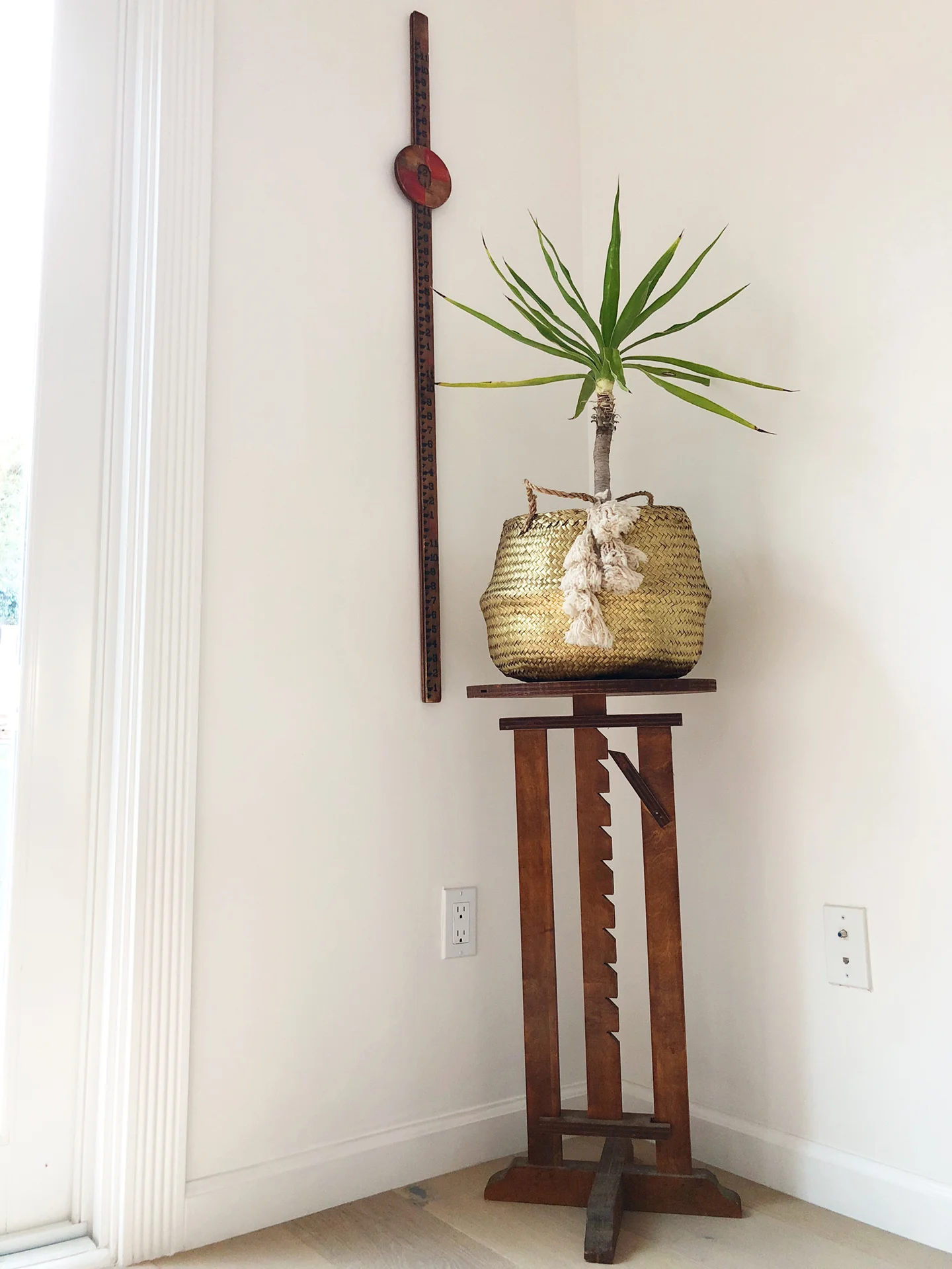
Vintage telescope molds add pops of color and conversational interest as wall art.
ON DETAILS
The gold basket mimics the brass decorative touches throughout to helps unifies the room.
REPEATING BRASS DETAILS
Contemporary touches of brass are on repeat to keep the newness of the home in mind.
FAMILY-FRIENDLY STYLE
This welcoming home is coastal California is perfect for a family. Adding touches of color and whimsy provided that playfulness that would appeal to kids. But providing these colors in thoughtfully designed pieces gives an adult-friendly style that’s perfect for parents.
A BALANCE OF COLOR
The existing green chairs provided great pops of color but to lessen their intensity, colors were added throughout the room to create balance.
KIDS BEDROOM BEFORE
The bedroom provided the necessities but didn’t have the personality to define it as a kids room.
CALMING COLORS
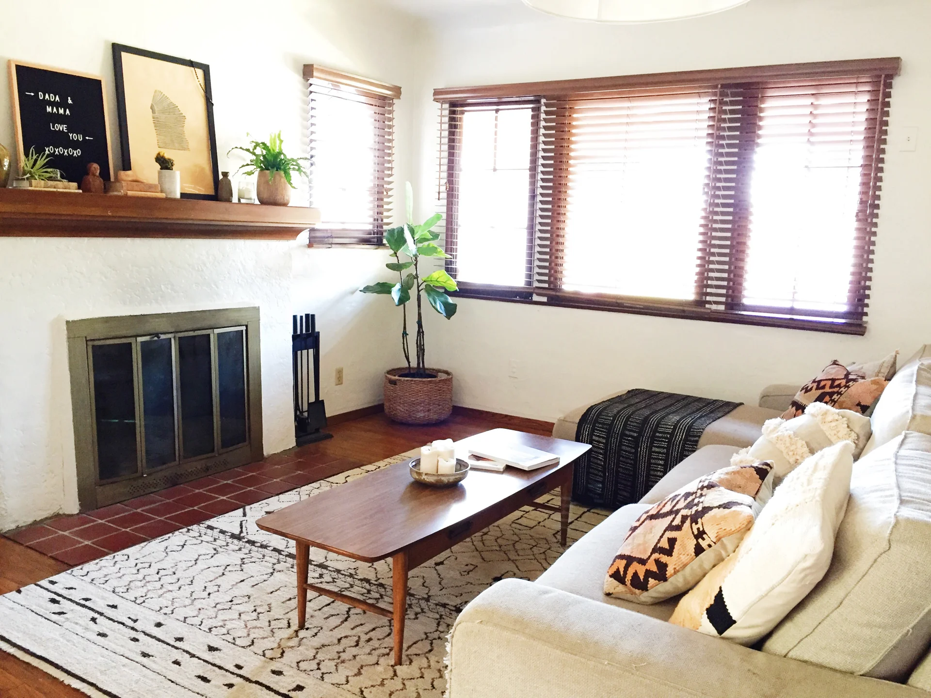
The living room provides a gathering space for relaxation, so the palette was kept to a calmer neutral. Textures and patterns add visual interest to the design.
ENHANCING CALM
Adding decorative pieces to the mantel in a neutral palette gives enough eye-candy without being a distraction to the calm vibe that a fireplace provides. A message board allows for changeable notes custom to the guests arriving.
NATURAL ELEMENTS
Easy-care plants were added to extend the use of color in a natural way. Textures from wood, pottery, and brass add warmth to the palette.
KIDS BEDROOM AFTER
Adding similar patterns and textures found in the living room but with added color provides cohesion in a playful way.
INVITING SETTING
Layered pillows and blankets add a coziness that invites guests to sit down and relax. A shared color palette allows a mix of patterns to work well together.
ADDING WARMTH
Although the fireplace isn’t often used in sunny California, it still adds to the feeling of calm to the home. Touches of nature, artwork, and books gives a hint of the interest of the homeowners and adds warmth even without a fire started.
MORE THAN JUST A PEDIGREE
This midcentury home has a great pedigree, having been designed by legendary architect Ed Killingsworth. It was a great selling point to lure people in, but not enough to keep their interest. So we gave it some life, using hints of its surroundings, as well as the homeowners taste. What came out was a robust personality waiting to be unveiled to WOW the world.
FAMILY ROOM
The room had the neutral basics… sofa, side chair and a beige rug, but it didn’t have anything that gave it personality. Since the entry was visible from this space, both spaces needed to act as one in the color story they told. Plants were added sparingly to provide a hint of the outdoors. An orange side chair was brought in for added color and a hint of the mid-century era of the house. A textile wall art continued the subtle Asian theme from the entryway. A coffee table was intentionally left out, so a patterned rug was layered over the existing rug to visually fill the space and add more depth.
ENTRY: BEFORE
The entryway had hints of Asian influence with the use of grasscloth wallpaper and a contemporary Asian-style console table, but they didn’t seem like purposeful decisions. The theme did fit well with the visible landscape of Japanese maple and succulents outside. But beyond that, the entry didn’t set a clear statement and served no real purpose other than become the spot to kick your shoes off.
LIVING ROOM: BEFORE
Laundry aside, the room was very grey. It wasn’t that the palette was completely neutral; it was that the textures of the sofa, dining chairs, and rug were all very similar, so the room read as one massive blob. There were no visual breaks of interest to capture the eye and create a pause.
PLAYROOM
The playroom was just a tv with a leather recliner in front of it. It didn’t prompt any playful activity other than hours of zoning out to cartoons. Vibrant colors were added to create a fun atmosphere. A cheerful rug was laid out to invite kids to sit down and read a book, play board games, or escape into a world of imagination.
ENTRY: AFTER
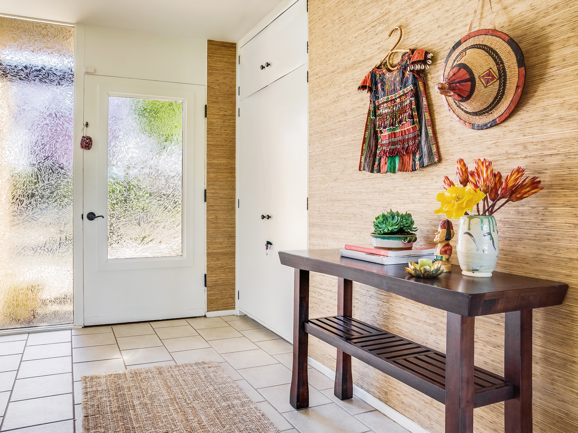
The entry characterized the tone of the house. The Asian influence became more defined by hanging an antique hat and traditional beaded shirt on a bamboo hanger. These provided the depth and texture which lacked from the original artwork. A potted succulent and decorative flowers mimic the colors and type of plantings outside. A natural jute rug replace the synthetic one for texture.
LIVING ROOM: AFTER
Opening the shades alone made a huge difference! We brought the outside in by adding colors and play of texture similar to the landscape. The client wanted to keep floor space free, to allow room for kids to play. So we layered a patterned rug to create the illusion of “filling” the space.
BATHROOM: B & A
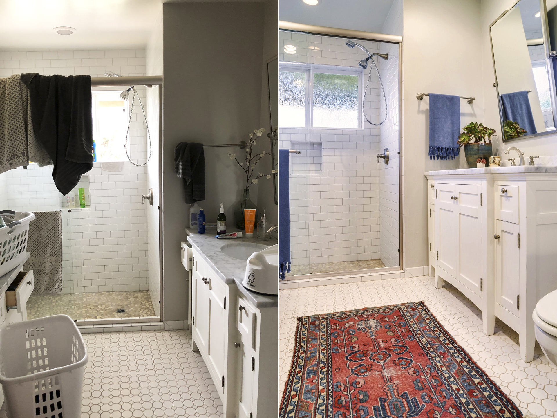
The bathroom presented a good neutral base but needed some life to keep it from looking dreary. We replaced the fake flowers with real succulents for instant freshness and create a connection to the rest of the indoors and out. A vintage rug and coordinating towels add the colors needed to liven this space.
IGNORING TRENDS TO STAY TRUE TO ITS BOHEMIAN SOUL
This adorable cottage is just outside of Ojai, CA with an owner that is passionate about textiles, handcrafted pieces, and nature. We stayed true to her passions but curated the collection and added some necessary living essentials to provide guests comfort alongside character.
BEDROOM 01
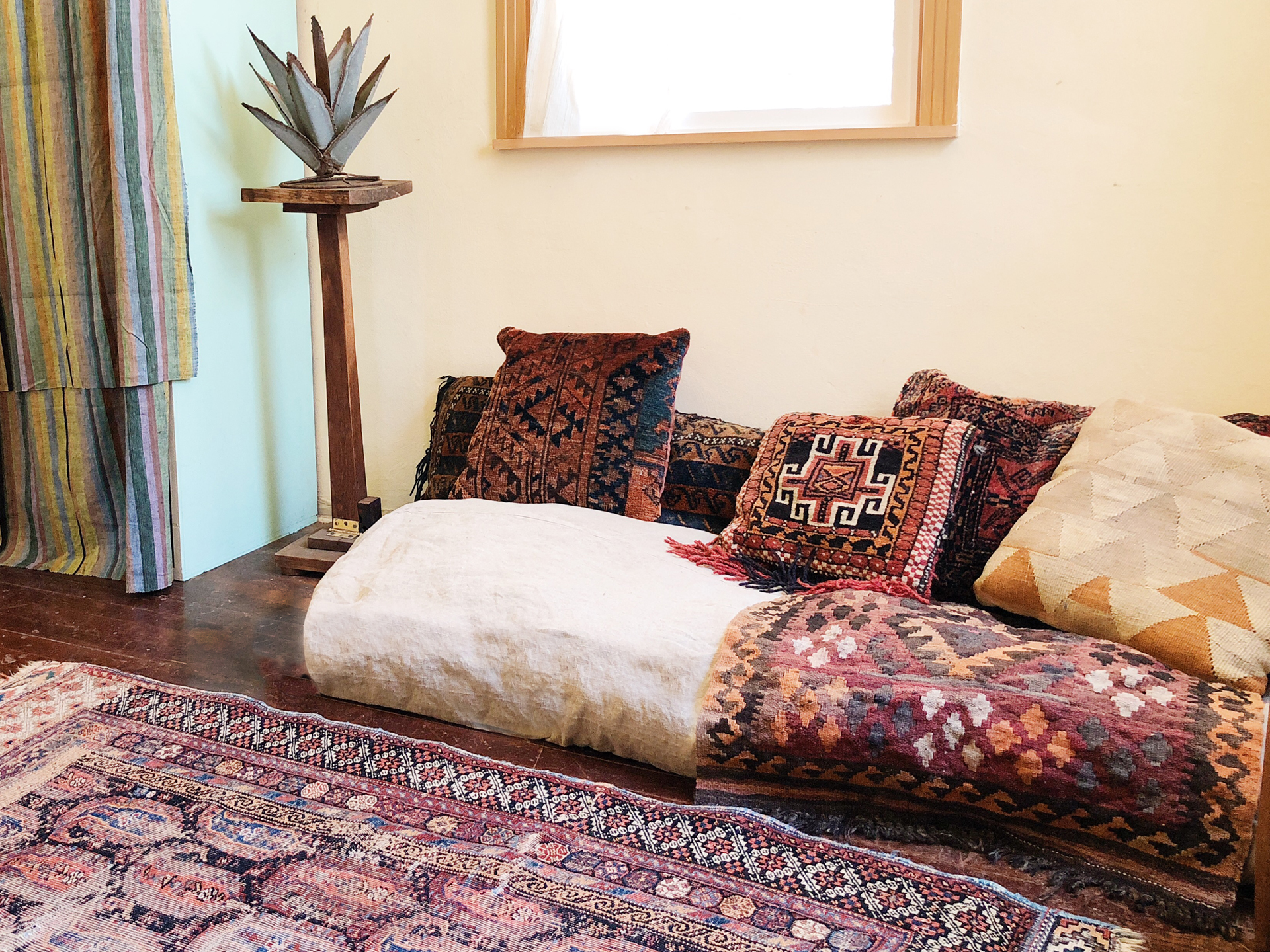
The bedroom needed a bed but a traditional mattress was not an option. So I set out to give this room my take on a dessert yurt. Natural linens were filled to create comfortable beds. Layers of vintage textile pillows and a Persian rug set the mood for rest and relaxation.
BEDROOM 02
This dessert oasis theme continues with a cot daybed layered with the coziest linen bed. Warm woods, natural fibers, and vintage textiles all add to a very Zen retreat.
KITCHEN
With the color and textile filled living room visible, the kitchen was left simple with bohemian touches provided by handmade pottery cups easily accessible, plants, and hand-painted art. Natural light streaming in is the perfect balance to the living room.
BEDROOM 01 DETAIL
2 vintage rattan chairs add a natural conversational atmosphere to Bedroom 01, giving the room a multi-purpose function. At any time of the day, it can act as a lounge area.
LIVING ROOM
While the living room did maintain its textile layered personality, taking some off and and adding thoughtful accessories created a more curated and intentional look. An eating area was added here for necessity and to keep the kitchen more open.


